
Building & Testing a Next-Gen Digital Warden Call Product
A discovery research, design and testing project for a leading UK based telecare provider preparing for the analogue to digital phone line switchover in 2027, exploring how to redesign their digital telecare ecosystem and define the next generation of products and services for residents, housing providers, and family influencers.
-
Tools
Figma
Adobe CC
MS Office
MS Teams
Float
Miro
-
Deliverables
Discovery insights & recommendations report
User testing insights & recommendations report
User stories
Suggested features/Requirements document
Redesigned wall mounted / tablet interface
Housing manager app
Mobile app mock up for family members
-
My Role
Discussion guide writing
Recruitment
Conducting interviews/expert reviews
Thematic analysis of findings
Prototyping (Figma)
Usability testing
Report writing
Context
A leading telecare provider was preparing for a major industry shift as UK analogue phone lines were due to be phased out by 2026. Because their existing products relied on analogue infrastructure, they would soon become obsolete and needed to be replaced with fully digital alternatives.
At the same time, the market was becoming more competitive, with new digital telecare products emerging. This created a need not only to modernise the technology, but also to improve usability, reliability, and overall experience to maintain market leadership.

The Challenge
The challenge was to redesign an outdated and overcomplicated telecare device into something that older adults with low digital literacy could use it confidently, while also meeting the varying needs of end users, housing managers, family members, and organisational decision makers. The existing device interface was confusing, difficult to navigate, and often misunderstood, which meant residents failed to recognise alerts and avoided using key features altogether. Housing staff also had limited digital tools to support residents remotely, and families had no visibility into whether their loved one were safe.
From a UX perspective, the task was to transform the existing tablet interface into a set of clear, accessible, and reassuring interfaces that could be easily understood and used by older adults with a variety of accessibility needs. This was especially important as the device needed to operate in a safety critical environment where every interaction has to be simple, unambiguous, and impossible to get wrong.

Methodology
We began with site visits to two supported housing schemes, observing how the telecare products were installed and used, and speaking with housing managers and residents to gather early context. A kick‑off workshop and 1:1 interviews with various members of the client’s internal product development team followed, aligning stakeholders on research objectives and confirming who we needed to interview, alongside building on our knowledge and context of the product space, e.g. regulatory requirements. We then carried out a series of discovery interviews, including thirteen B2B customer and housing‑manager interviews, eight interviews with residents and B2C end‑users, and eight interviews with influencers across both B2B and B2C contexts. Finally, we held a workshop with the product and development teams to sense check emerging recommendations and clarify technical or business considerations before moving into the design of the MVP.
This approach ensured every design decision was grounded in real user insight, behaviour and operational realities.

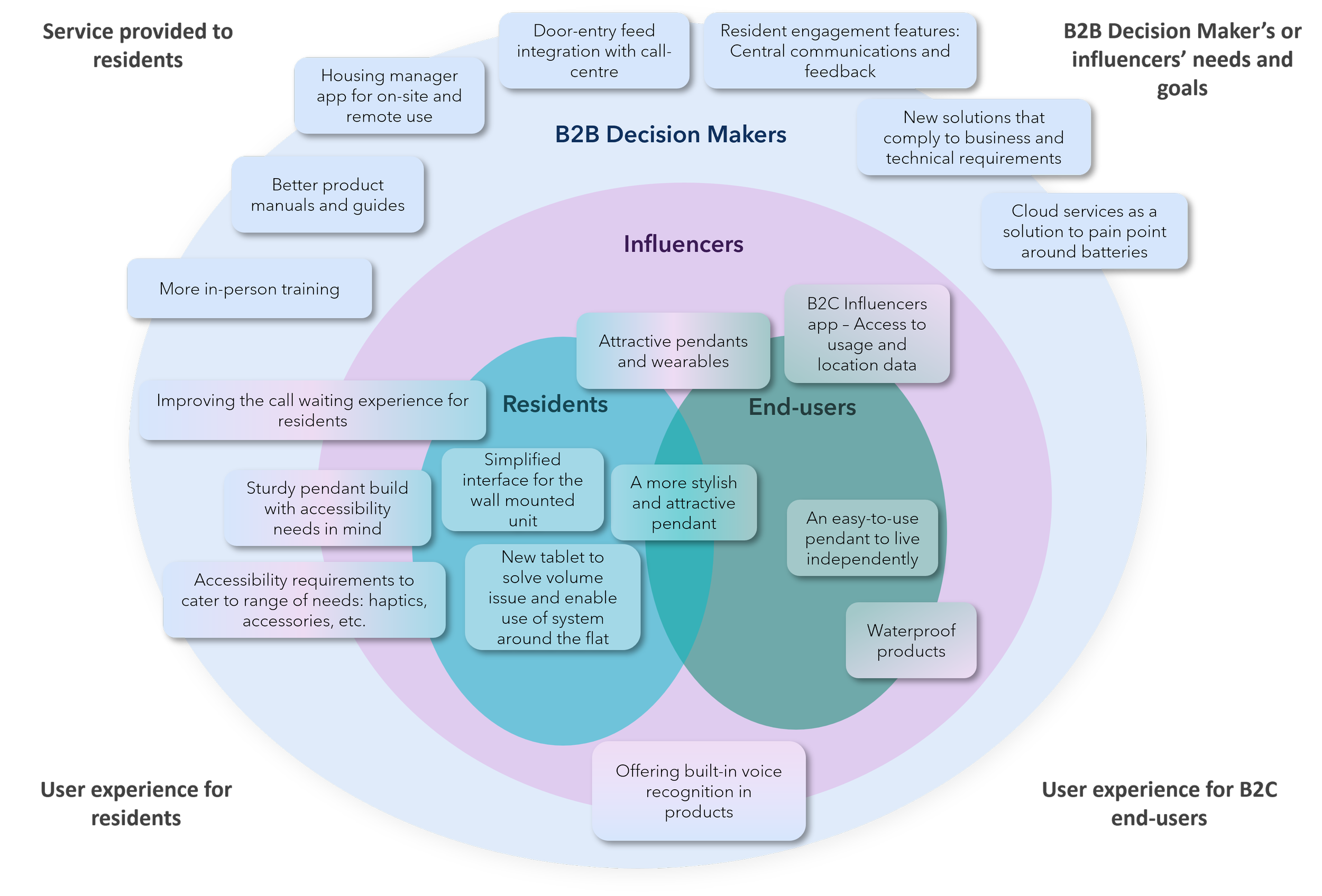
User Groups Definitions identified:
-
Older adults living in supported or sheltered housing schemes where the telecare system is installed as part of the accommodation. They often do not make decisions around which telecare provider is installed, although decision makers tend to take their preferences into consideration.
-
Individuals living independently at home who subscribe to a personal alarm service for additional safety and reassurance.
-
Onsite staff responsible for managing supported housing schemes and acting as the main point of contact for residents using the telecare system.
-
Relatives, friends or close contacts who help older adults (B2B residents and B2C end-users) make decisions about telecare services and stay informed about their wellbeing. In many cases, the influencer is also the one who gains reassurance from the service, and is ultimately the driving force behind the purchasing decision.
-
Senior stakeholders responsible for selecting, purchasing, and managing telecare solutions across multiple housing schemes or service portfolios. This type of user is viewed as a customer by the telecare provider.
Findings & Solution
Portable Tablet v1 Interface
Residents frequently missed alerts because the wall unit couldn’t be heard from other rooms. Even when they did hear it, the interface felt “too technical” leading many to avoid using anything beyond the emergency button.
To address this, the tablet interface was redesigned around clarity, visibility, and simplicity. In addition to the wall mounted unit, a separate portable tablet was included to allow residents to move around their homes, while still being able to answer the door, accept calls, and raise an alarm from a more convenient location such as the bedside table. Alerts now appeared as large, high‑contrast banners that remained on screen until acknowledged, ensuring they can’t be missed. The home screen focuses on just the essential actions, supported by large typography and text paired with icons that reduce cognitive load. Key flows, such as calling for help or answering an incoming call, were rebuilt as linear, step by step interactions that guide residents through the process without ambiguity.
The result is an interface that residents can understand at a glance, improving confidence and reducing missed alerts.

-
![]()
Portable Tablet Interface: Home screen with unread messages notification
-
![]()
Portable Tablet Interface: Home screen with a missed call notification
-
![]()
Portable Tablet Interface: Home Screen without repairs feature
-
![]()
Portable Tablet Interface: Front door entry call
-
![]()
Portable Tablet Interface: Front door entry call accepted
-
![]()
Portable tablet: Flat to flat incoming call
-
![]()
Portable Tablet Interface: Flat to flat call accepted
-
![]()
Portable Tablet Interface: Privacy call
-
![]()
Portable Tablet Interface: Flat to flat call with alarm
-
![]()
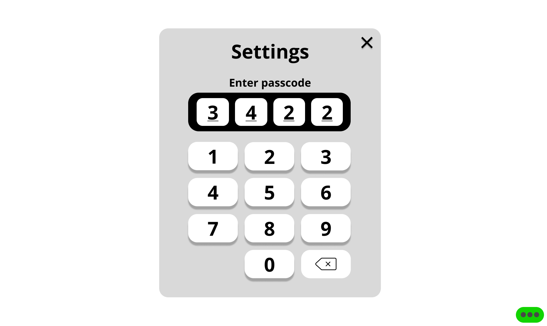
Portable Tablet Interface: Settings menu lock screen
-
![]()
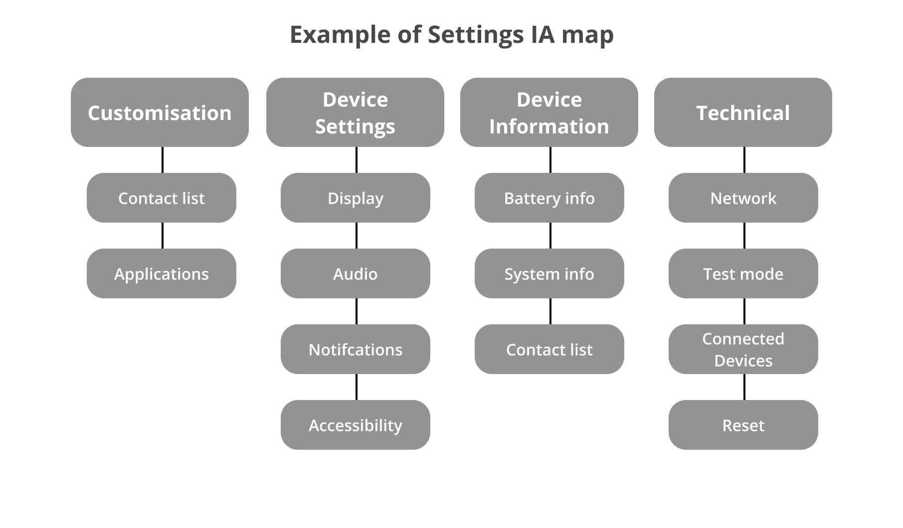
Portable Tablet Interface: Settings menu IA


Core features and considerations for future products & services (as a whole system)
Phase 2: Usability Testing & Iteration
Validating the MVP with Residents
Following the discovery research and design of the MVP, we were invited back to validate the solution with real residents before development progressed further.
Using an interactive tablet prototype, we conducted moderated usability testing to understand how effectively residents could complete key tasks, identify accessibility and usability issues, and gather feedback to inform future iterations of the product.
Approach
Working closely with the product team, we prioritised the most critical user journeys for testing and created a structured discussion guide around the core features of the new telecare experience, including:
Wellbeing check-ins
Housing manager calls
Door entry calls
Emergency alarm activation
Neighbour-to-neighbour calling
Messages and surveys
System notifications and alerts
General navigation and home screen interactions
We spent a full day at a supported housing scheme, running 30-minute moderated sessions with 10 residents aged between 65 and 95. All participants were existing users of the current telecare system, allowing us to compare their experience of the new solution against the product they used every day.

Summary of findings for MVP Improvements
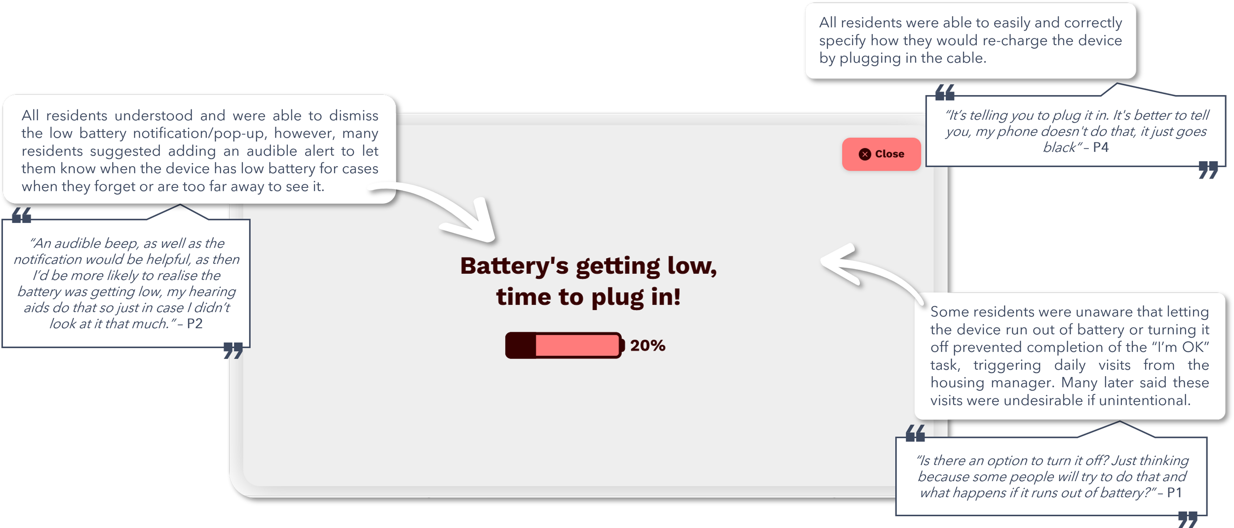
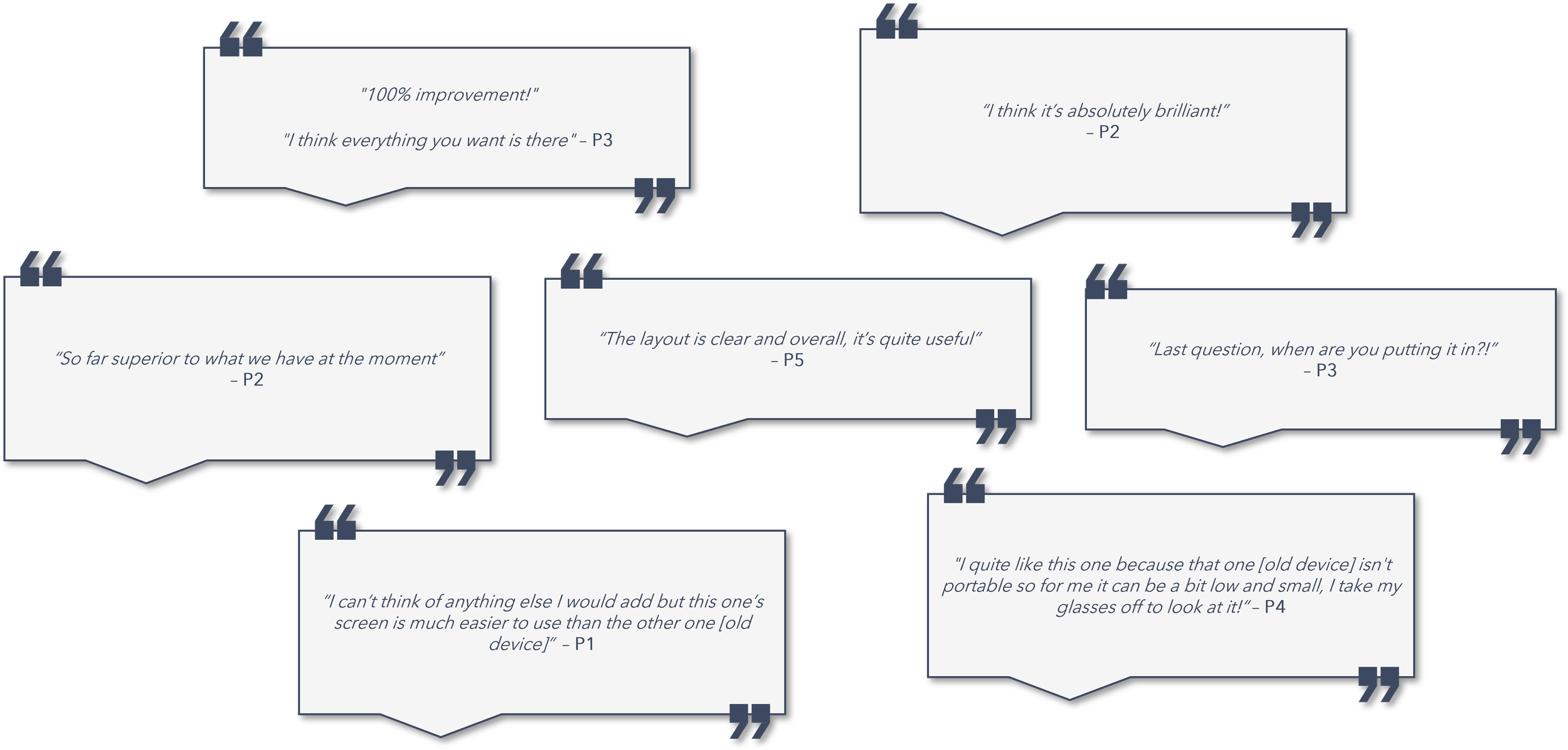
While overall feedback was overwhelmingly positive, the testing uncovered several opportunities to improve clarity, accessibility, and confidence throughout the experience.
Residents particularly valued:
The larger, more accessible interface.
Improved door entry experience.
The portability of the tablet compared to fixed wall-mounted devices.
Clearer navigation and larger touch targets.
However, testing also revealed areas where the design could be refined even further:
Several residents struggled to understand the difference between "I'm OK" and "I'd like a check-in".
Users wanted clearer guidance on where emergency and housing manager calls were routed.
Some interface states relied too heavily on memory, making it difficult to recognise when actions had been completed.
Scrolling interactions and message states were not always obvious.
Participants requested stronger battery warnings and clearer guidance about the consequences of a device running out of charge.
The emergency alarm flow needed stronger visual distinction and a shorter countdown period.
Detailed MVP Improvements & usability findings
-
![]()
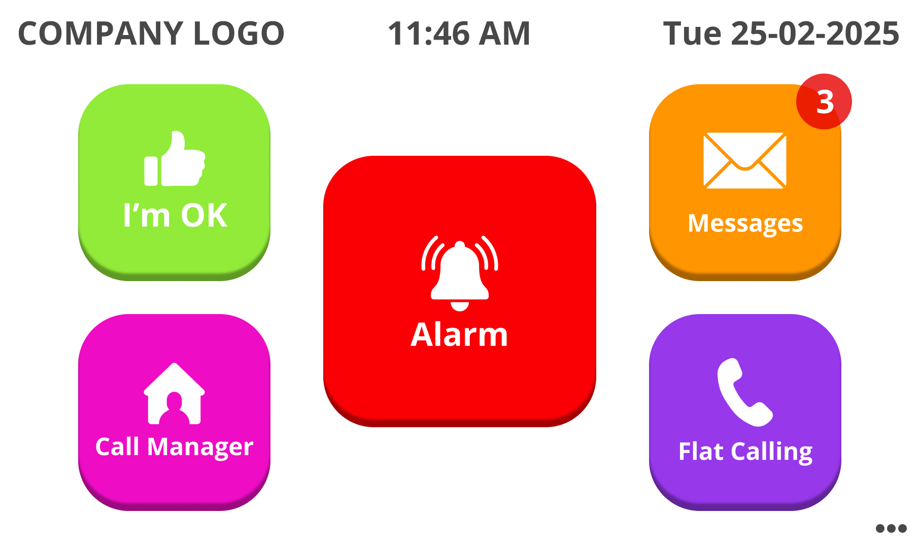
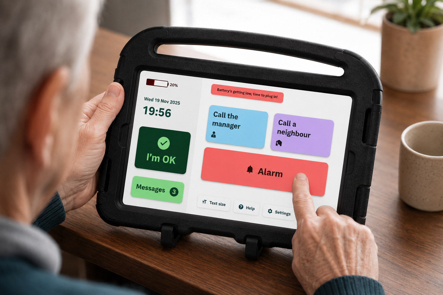
1. Main Navigation Home Screen
-
![]()
2. Wellbeing Check-in Screen
-
![]()
3. Housing Manager Call Screen
-
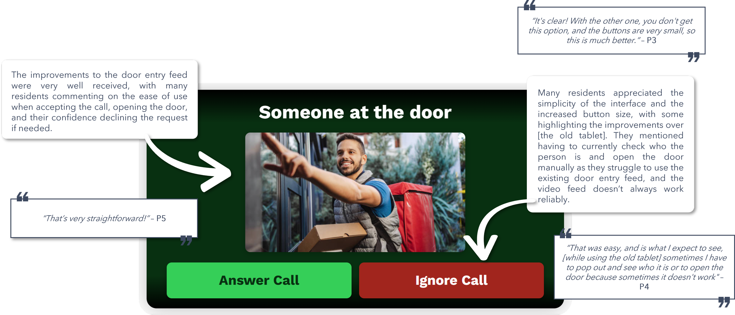
![]()
4. Door Entry Screen
-
![]()
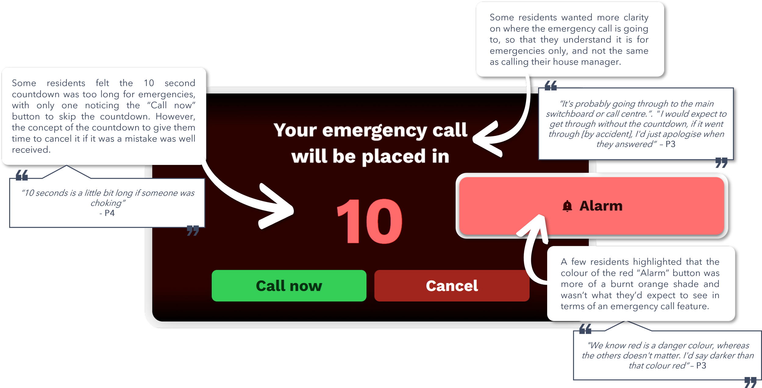
5. Emergency Alarm Screen
-
![]()
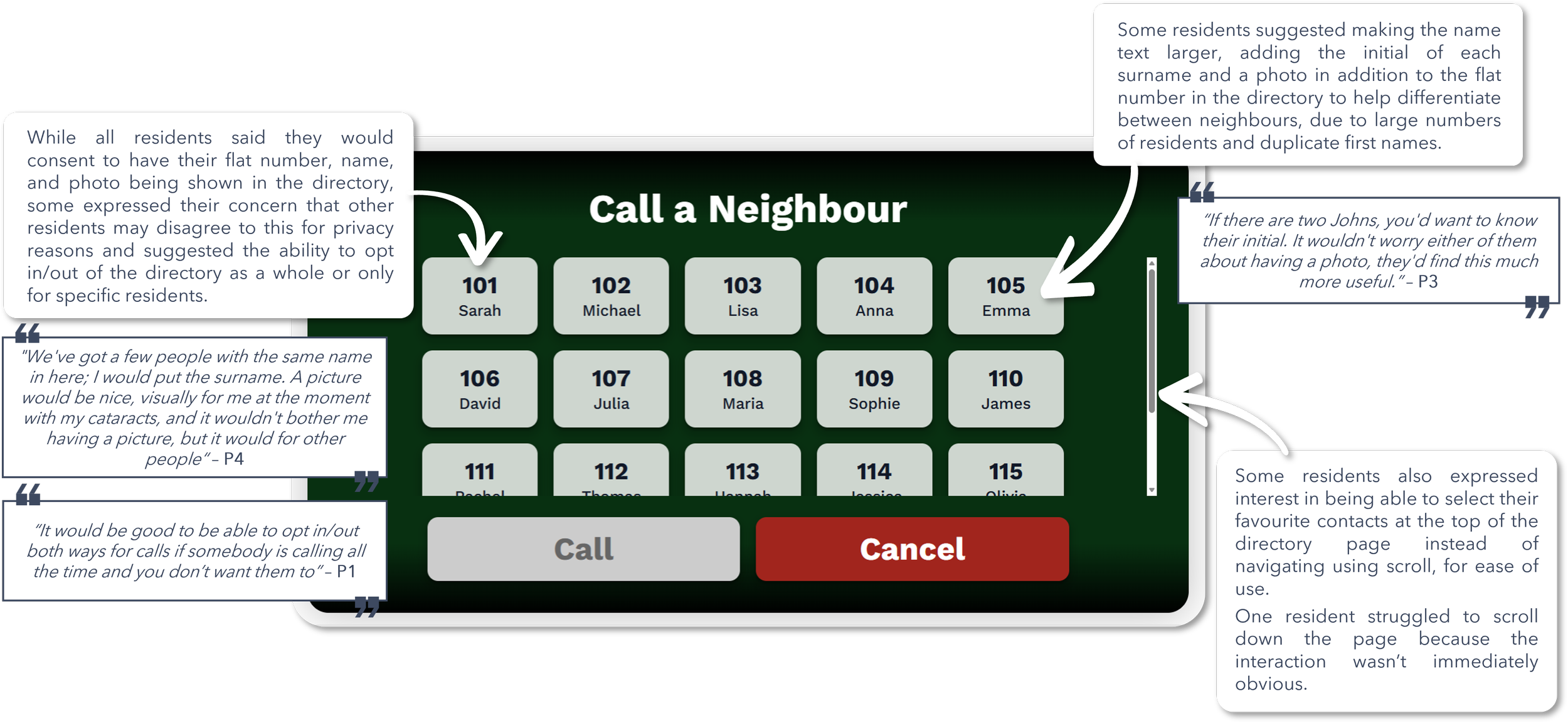
6. Neighbour-to-Neighbour Calling Screen
-
![]()
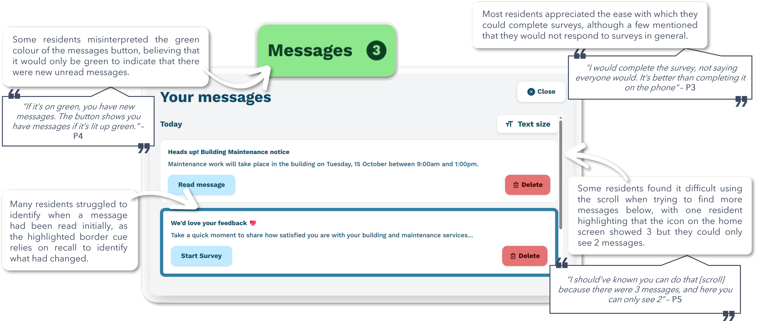
7. Messaging & Survey Screen
-
![]()
8. System Notifications & Alerts Overlay
-
![]()
Overall Feedback from Users
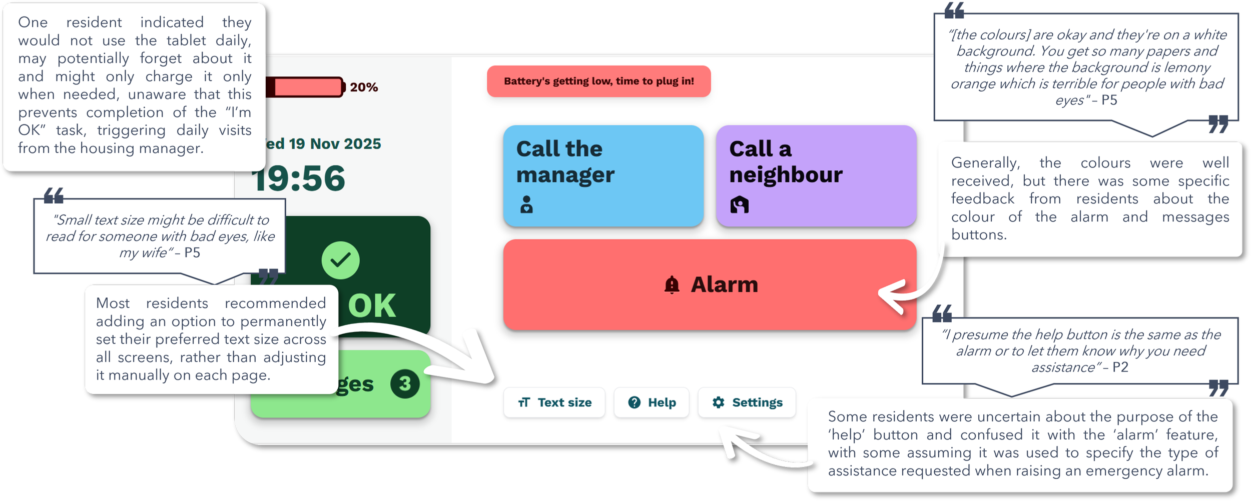
Key take aways
Designing for a Diverse Range of Users
One of the biggest challenges during this project was designing a product/service that worked for multiple user groups, all with very different needs and priorities (for example, taking into account not only the primary users as the residents themselves, but also the housing association decision makers wanting to include surveys). The client, residents, housing managers, family members, and organisational decision-makers all interacted with the service in different ways and had different priorities and expectations.
The project reinforced the importance of balancing competing priorities and user needs while keeping the experience as simple as possible for the people who rely on it most, rather than allowing the core functionality of the device to be overshadowed by optimising for a single stakeholder group.
Designing for accessibility means designing for the unexpected
This project taught me that accessibility challenges aren't always obvious. While we expected to design for varying levels of digital literacy, the research stage uncovered less visible needs that significantly influenced the design of the final product.
For example, we discovered that large black interface elements could cause anxiety/fear for residents living with dementia, challenging what might otherwise be considered standard design practice. We also found that seemingly straightforward features and language were often interpreted differently by users than intended.
The experience reinforced that designing for older adults goes beyond larger text and buttons. Truly inclusive design comes from testing with real users, uncovering unexpected behaviours, and challenging assumptions throughout the design process.