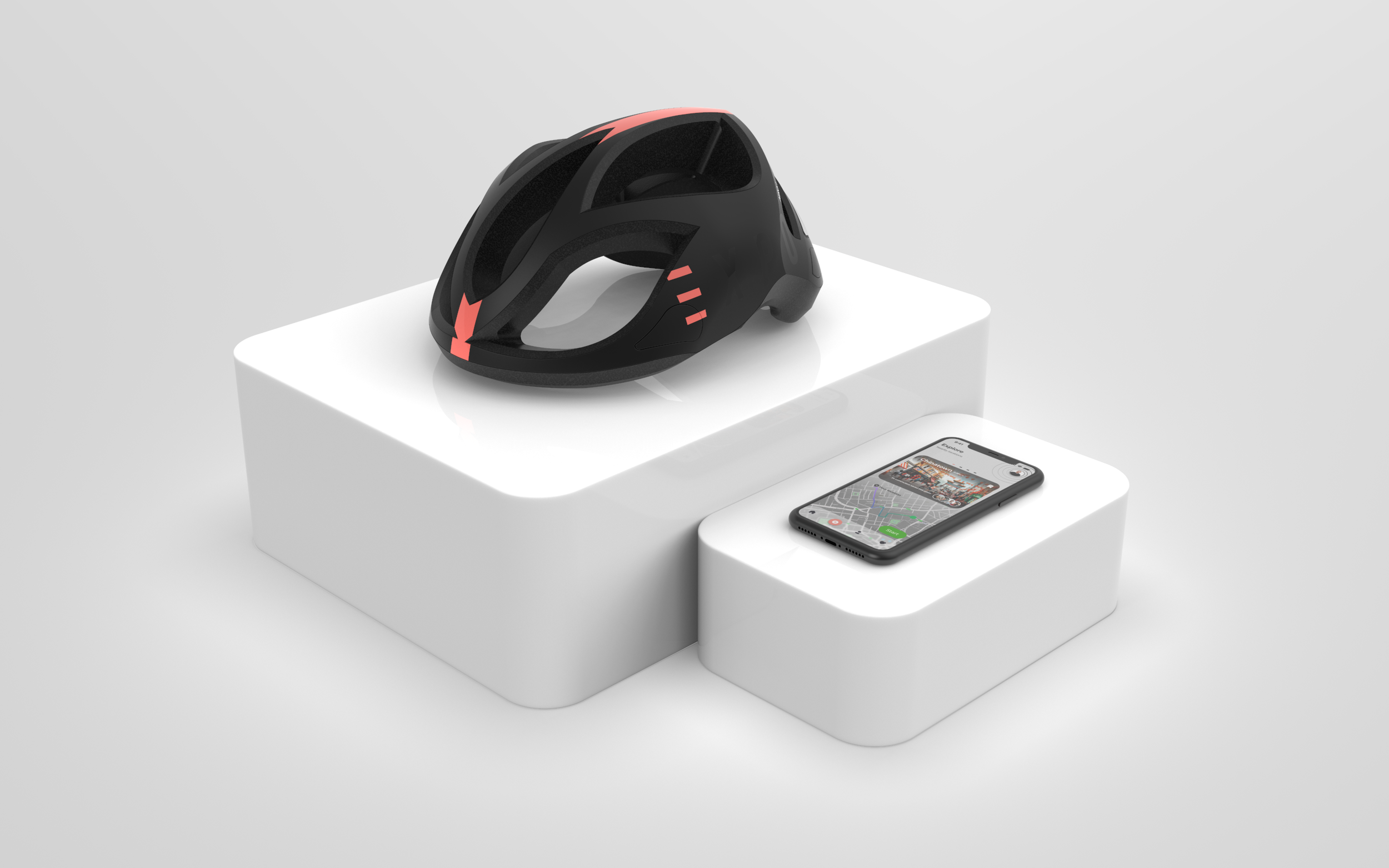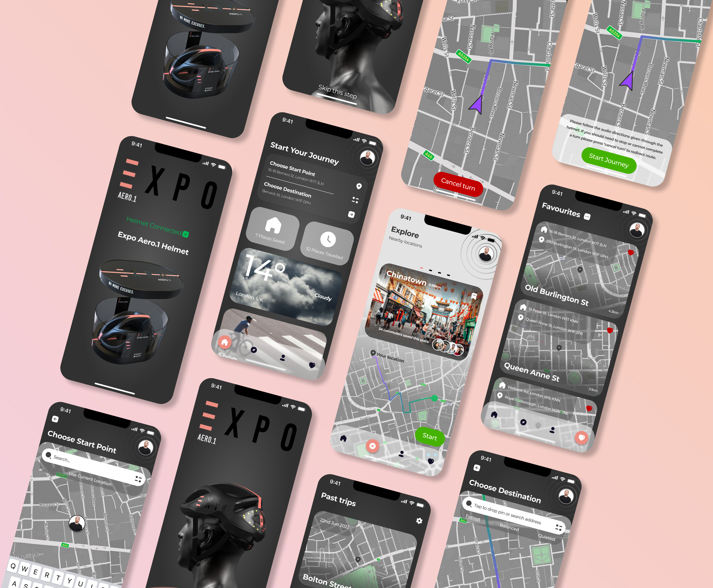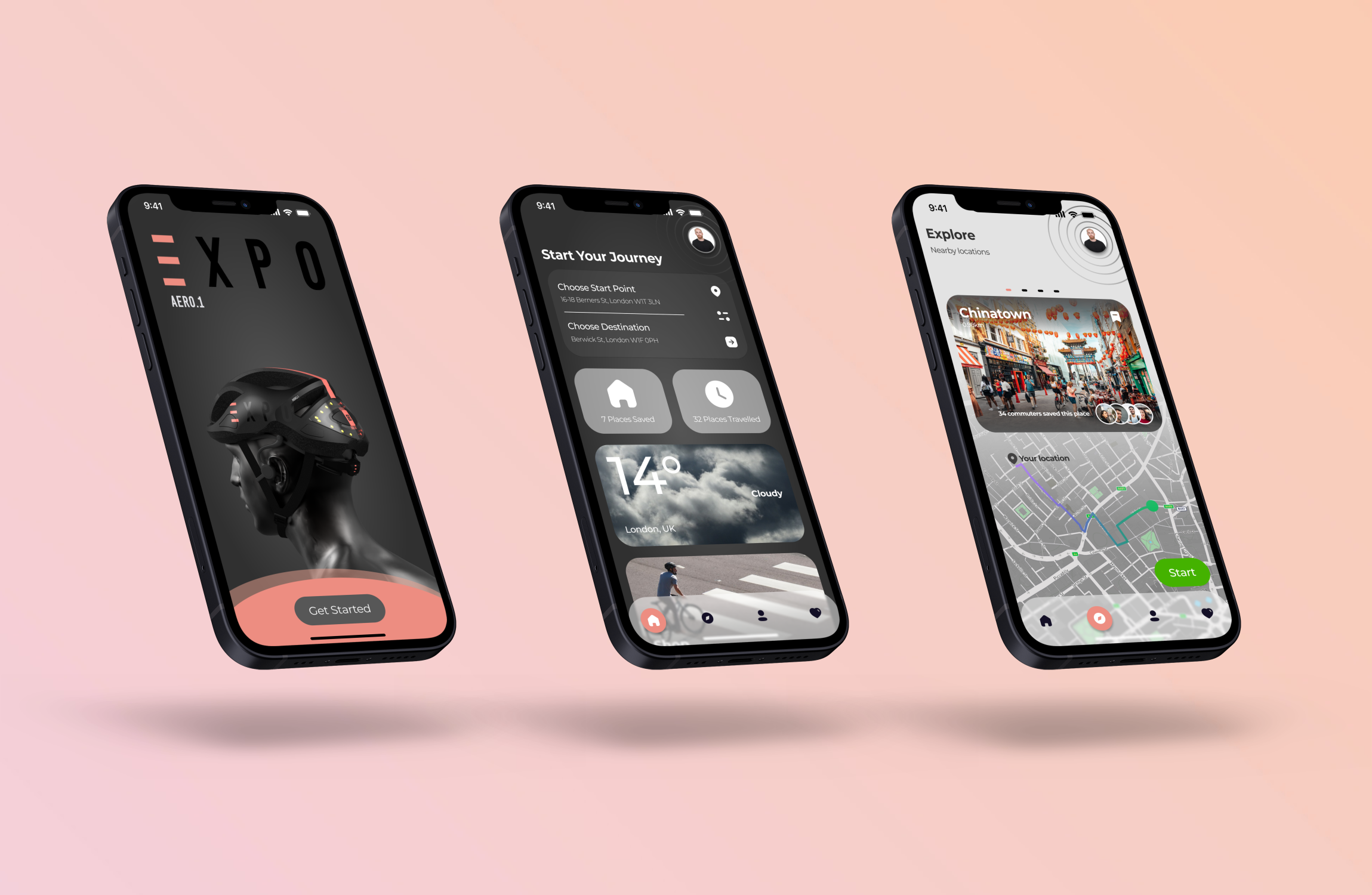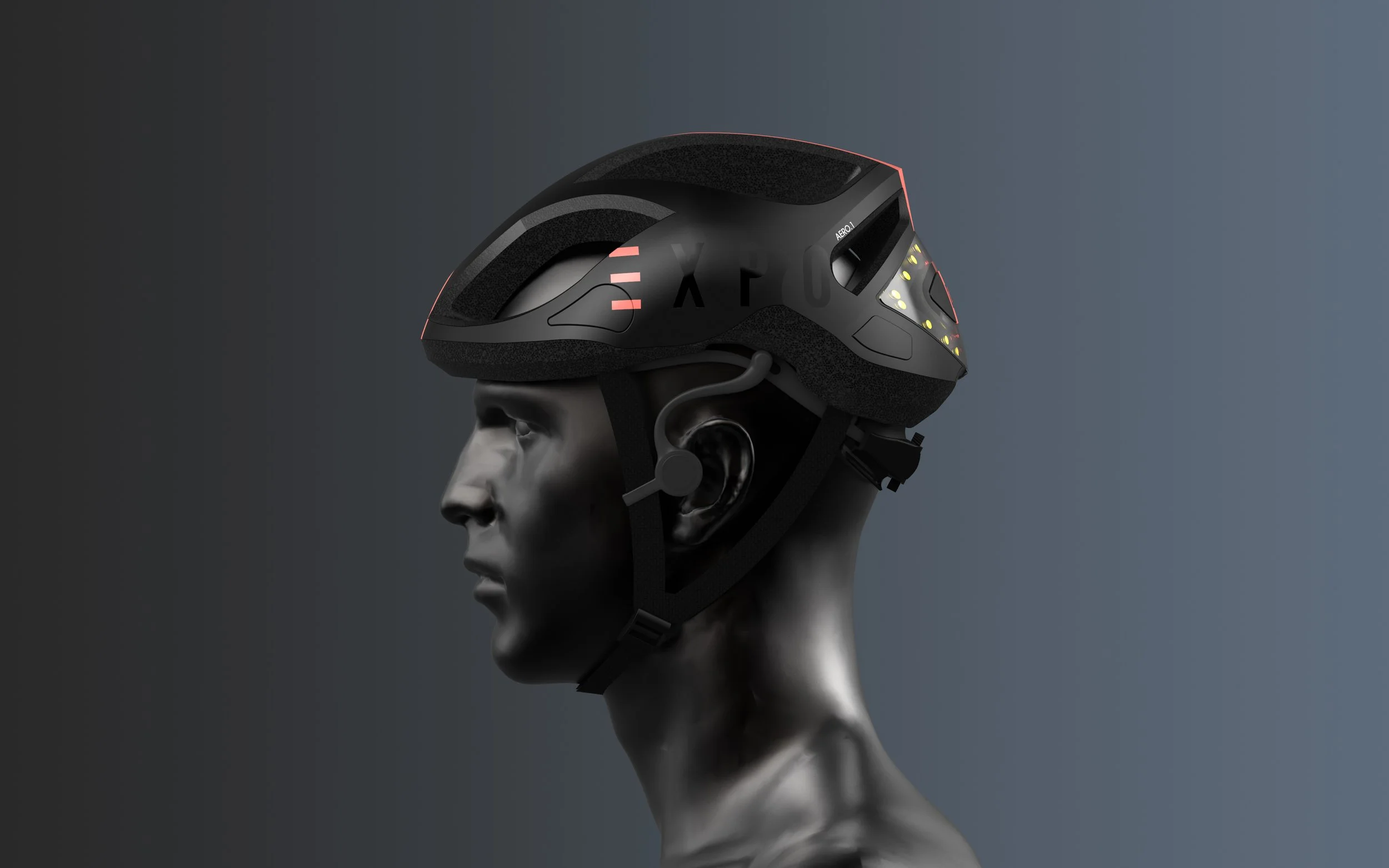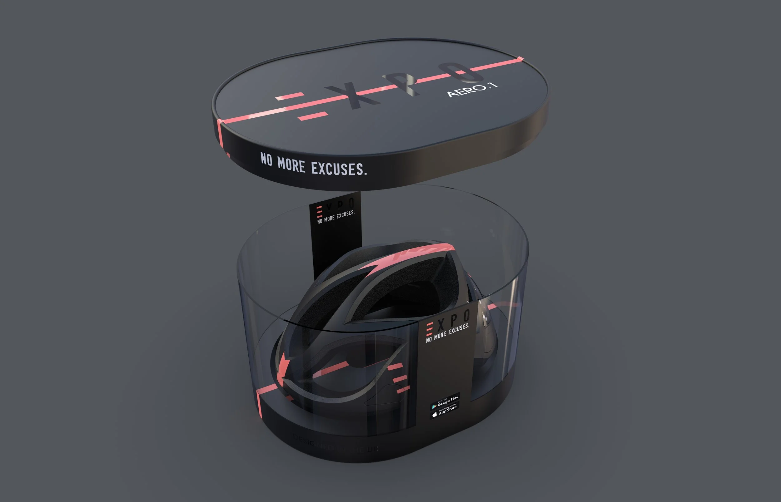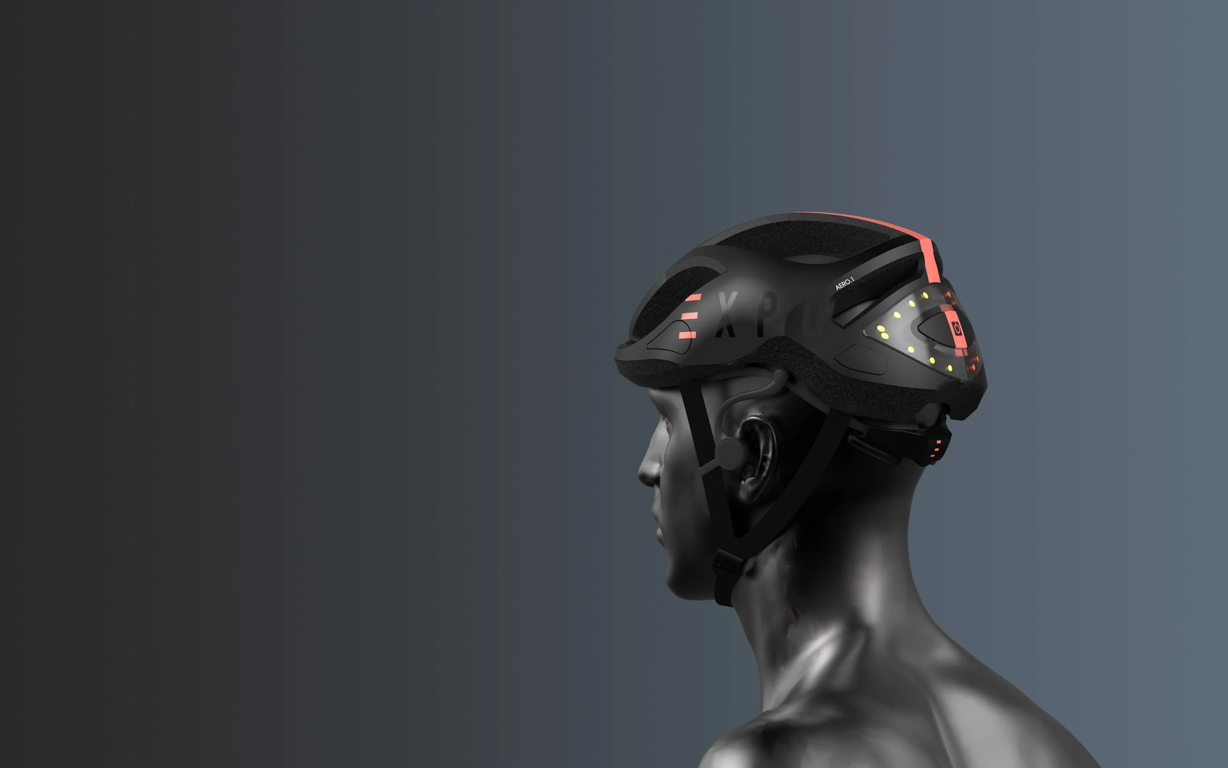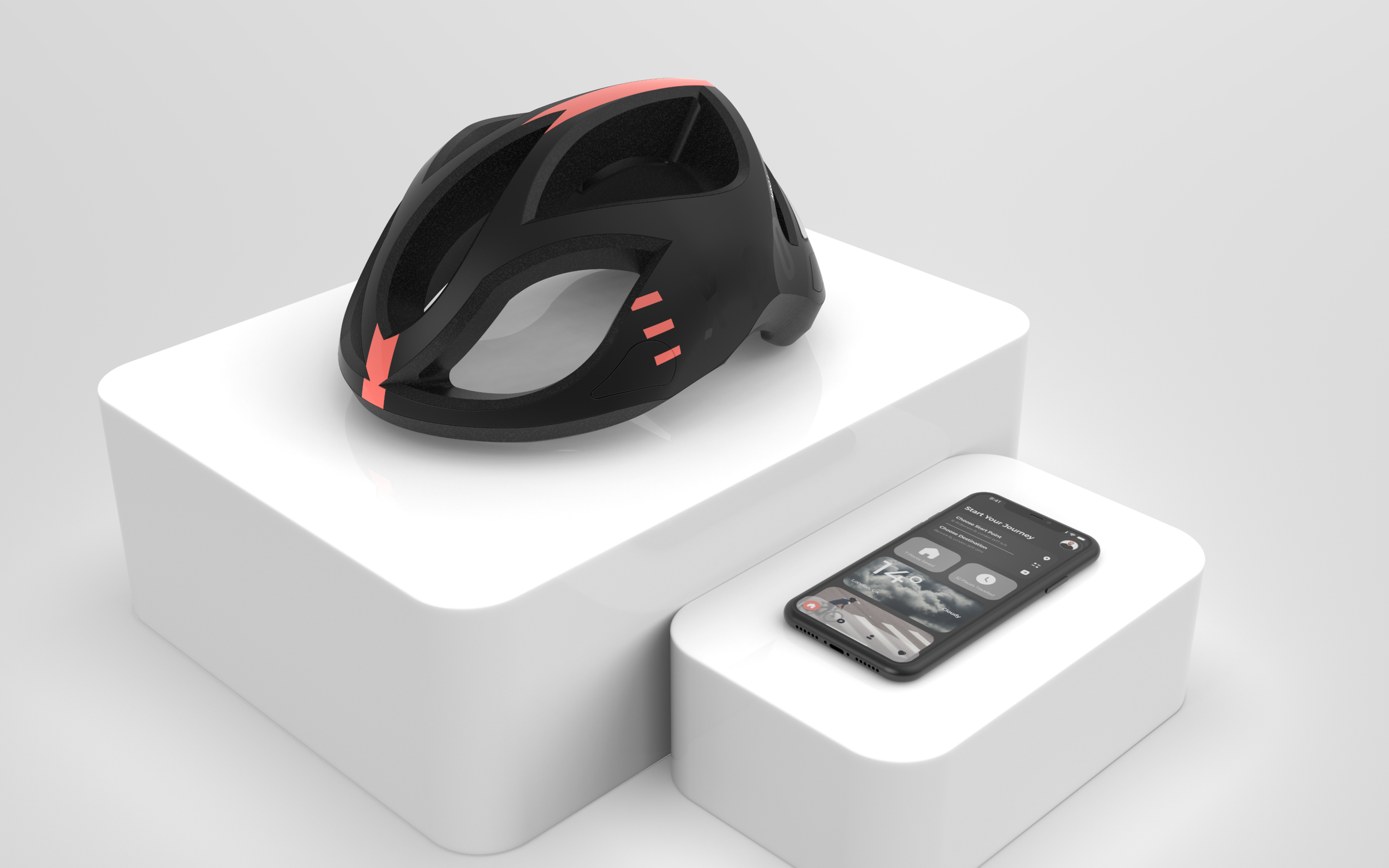
EXPO Aero
The EXPO Aero bicycle helmet and companion app help to reduce sedentary lifestyles by breaking down the barriers to entry for inexperienced new and prospective commuter cyclists, with a focus on urban environments.
-
Timeframe
3 Months
-
Tools
Figma
Adobe Suite
Mural
Solidworks
Keyshot
-
My roles
Discovery research
Journey mapping
Empathy mapping
Developing personas
Prototype development
Methods
Listed on the right are all the methods used in each step of the design process.
-
Secondary Research
Literature review
Primary Research
Survey
Diary Study
Follow up Interviews
-
Key Insights
Personas
‘As Is’ Experience Mapping
Empathy Mapping
-
How might we?
‘Yes and…’ Brainstorming
3-6-5 Workshop
Design Charette
Weighted Pugh Matrix
NUF
Sketching
Card Sorting
Wireframing
Information Architecture
-
Synergizing Ideas
Focus Group Usability Testing
Hi Fidelity Prototyping
Discovery

What’s the scope of the issue?
According to the World Health Organisation, it is estimated that physical inactivity causes 1.9 million deaths and 19 million disability adjusted life-years (DALYs) globally and causes 10-16 per cent of cases of breast cancer, colon and rectal cancers, and type 2 diabetes, as well as 22 per cent of ischaemic heart disease (Racioppi, Dora and Rutter, 2005). If just 167 European countries achieved a cycling mode share of just 24.7% over 10,000 premature deaths due to physical inactivity were estimated to be avoidable annually (Mueller et al., 2018). Creating an environment where people actively choose to walk and cycle as part of everyday life can have a significant impact on public health and may reduce inequalities in health (PHE, 2013), given that 18% of the mortality rate among adults is related to physical inactivity (Hansen and Nielsen, 2014).
What are the barriers to entry?
Cycling in a city is not an easy task. Traffic signals, cars, pedestrians, other bicycles, weather conditions, inappropriate roads, obstacles, are some of the things a cyclist needs to take carefully into consideration to safely complete a ride (Alarcon and Ferrise, 2017).
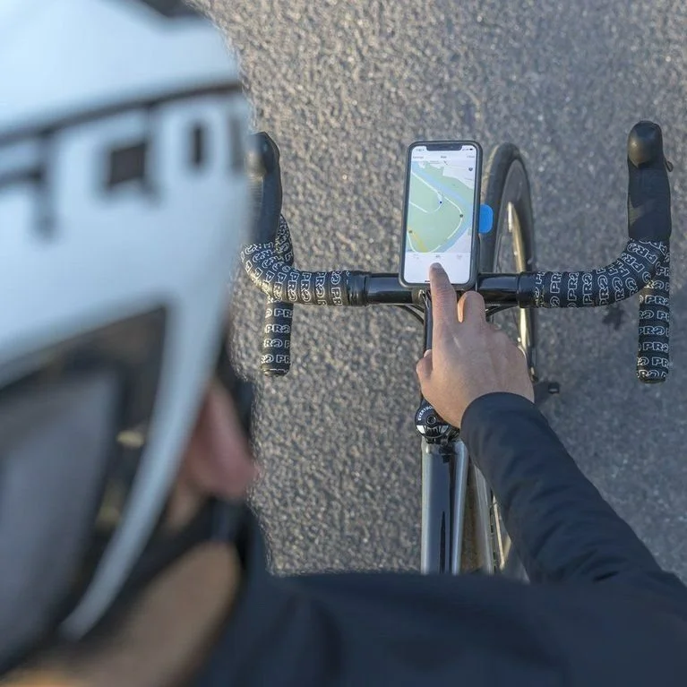
Point A to point B in unknown surroundings is easier these days by using GPS and offline or online Apps that can route the way and give turn-by-turn instructions (these tools are generally available for smartphones). Nonetheless, the use of this option is inadequate and risky for cyclists. On one hand moving their eyes and attention away from the road to check the screen and to perform a secondary activity is unsafe and can increase the probability of an accident (Alarcon and Ferrise, 2017). Technological systems for use when cycling is a recent growth area. However, a fundamental challenge for these interactive systems is the unsuitability of traditional user interfaces for use while cycling, which can cause safety problems as systems constrain and capture attention (Dancu et al, 2015)

Who are the target users?
The secondary research carried out in the first stage of the study proved to be beneficial in providing an overall scope of the issue and highlighting some of the key problem areas that act as deterrents for inexperienced cyclists. However, this wasn’t nearly sufficient enough for me to jump straight into idea generation, and I needed more detailed quantitative & qualitative data from real life users to gain an understanding of who exactly the user(s) are? What are their most significant barriers to entry? and what frustrations do they face as an inexperienced cyclists? The methods I used included an online survey that attracted 185 participants, a 5 day diary study with a selection of 8 participants who had recently taken up cycling as a commute mode, and follow up interviews to delve deeper into their individual experiences. Each phase of the research helped to lead and refine my line of questioning, create relevant screening requirements for diary studies and interview participants, and with each method becoming more concise and selective, I was eventually able to create a range of clear insights and latent users needs. Having defined the specific areas of frustration I was going to tackle, I also carried out some competitor analysis to see what and how the similar solutions already available on the market attempt to solve some of these issues. I felt this was necessary because a lot of the beginner cyclists I interviewed already used an existing navigation and safety tools.
“Looking down at my phone for directions feels really dangerous because I’m not looking where I’m going.”
- Quote from Joe (diary study participant).
“I get lost easily, especially when I have to deviate from my normal route and I’m tired in the morning.”
- Quote from Chris (interview participant).
Define
Key Insights

Using my research data and key insights, I created a persona of the target user to consolidate all of the results into a more concise representation to elicit empathy, and guide the design process going forward.
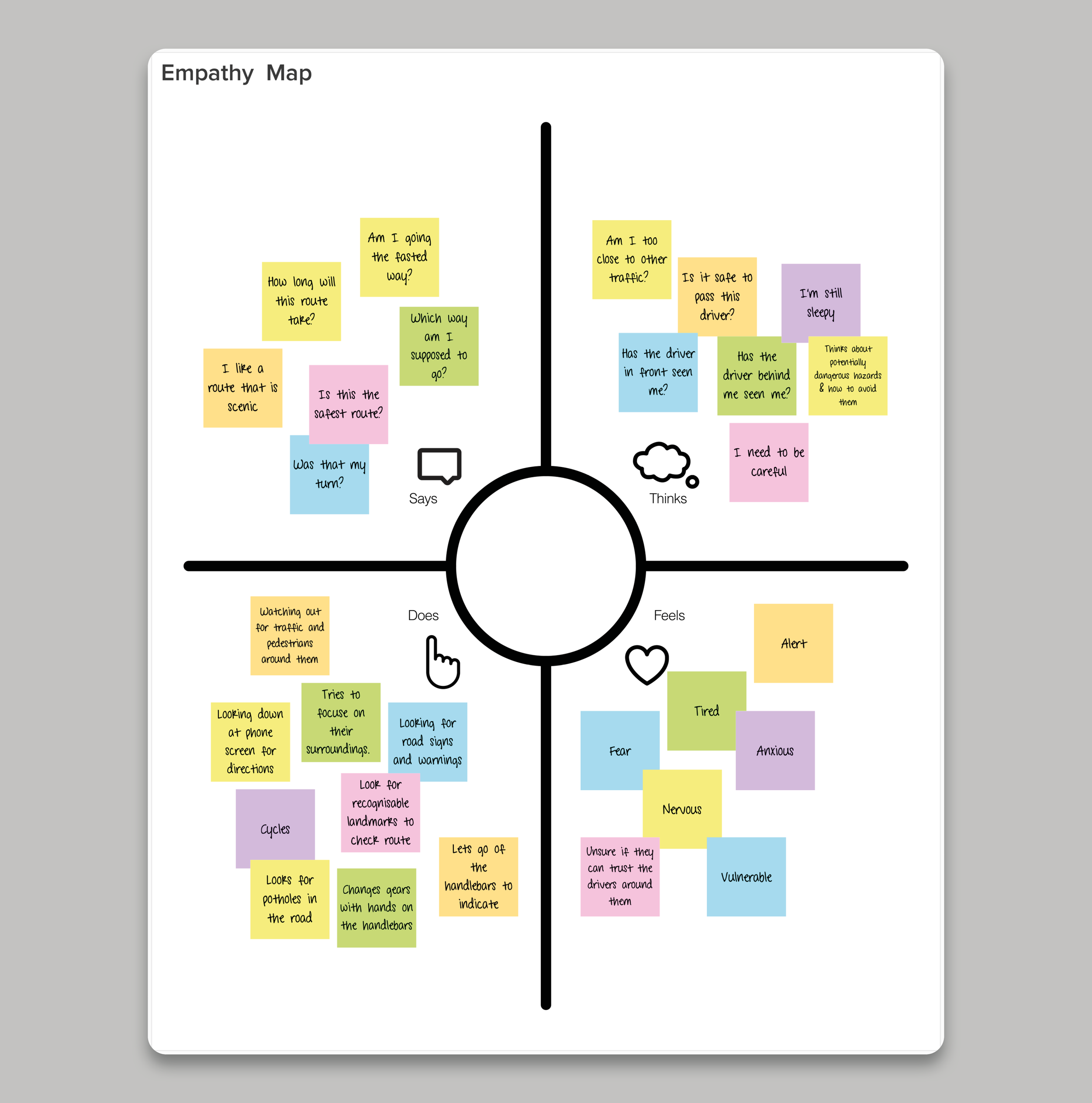
Making an empathy map of my user was useful to ensure I had fully understood the mindset and thought process they were in when commuting with their current tools, and acted as a visual aid of the actions, thoughts and emotions of the user.
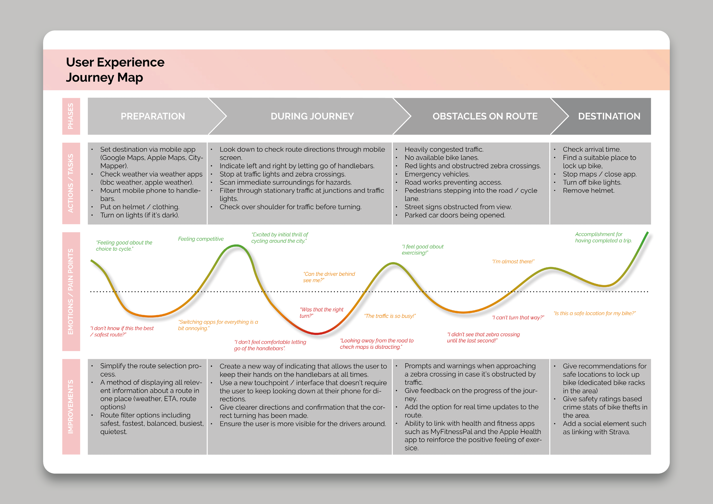
Creating a user experience map of the ‘as is’ process the user goes through using their current tools and methods when cycling to work was extremely useful in outlining pain points and key areas of frustration, as well as the key areas for improvement that could be used to give direction to the development phase of the project.
Development
Workshops
Nine opportunity ‘how might we...’ (HMW) statements were created by rephrasing the design goals outlined during the research phase. These were then used in a number of focus groups and workshops to generate ideas using methods such as ‘Yes and…’ brainstorming, a 3-6-5 session, and a larger design charrette. Within the first few minutes of the first idea generation session it became clear that without an in-depth knowledge of cycling from the participants, the results generated from group members were mostly unrelated or irrelevant. In response to this, twenty four refined how might we statements were drawn up from the initial nine that were easier to understand, and broke down the complex questions into comprehensible bite-size chunks.

Conducted as a group of 15, the design charrette was a great way of generating a large number of ideas from a wide range of different perspectives. However, a key limitation of using this method was that by enlisting a wide range of perspectives, also came a greater risk of misinterpretation, often resulting in irrelevant or off topic ideas. This was, however, balanced out ensuring the revised HMW statements were more concise and by a key feature of the design charrette method, in that by developing on top of the previous round of ideas 5 times, many of the results ended up well rounded idea statements regardless, as well as a wide range of ideas.
A total of 168 ideas were formed using these methods. Some were fully formed concepts, and on the other hand some were just suggested features. It was necessary to use a convergent filter to remove the irrelevant/unfocused ideas and reduce the total number of ideas until it was clear which idea(s) would most effectively solve the problem. For this I used a number of methods including separating the good, okay & bad, and holding a focus group to filter the remaining ideas by scoring them through an NUF matrix. The final ideas were then synergised where possible and finally processed using a weighted Pugh matrix against the URS outlined during research.
Wireframing
This space is being updated soon…

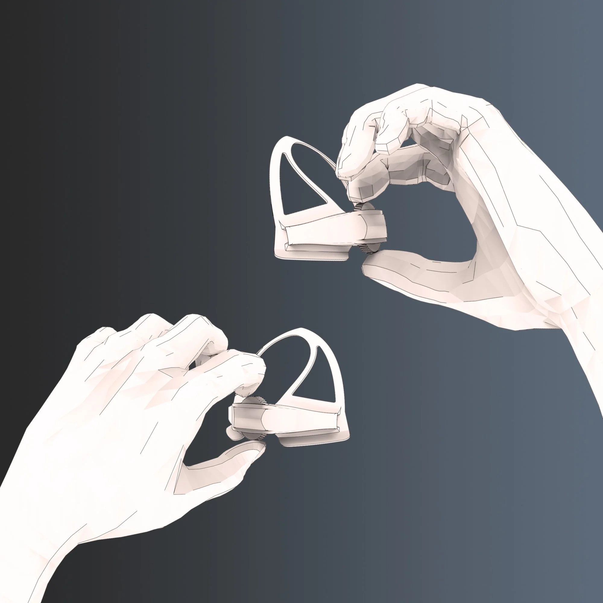
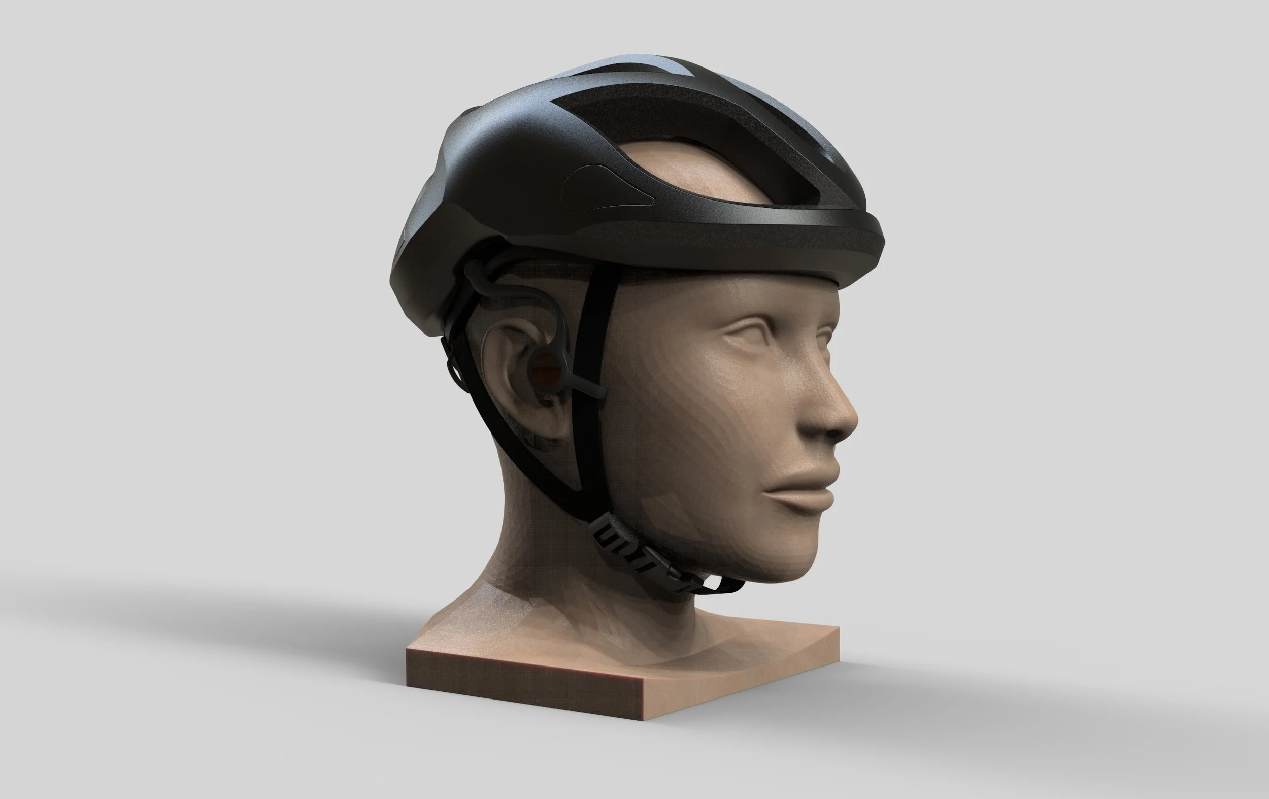
Delivery